Archive for the ‘Uncategorized’ Category

Competitive Analysis

March 30, 2011

Following on from my last post to create an effective portfolio for my work the next task was to look at other professionals that I would class as competition.

After searching the Internet and looking at various portfolio sites I came across Mark Petherbridge. According to Mark’s portfolio web site he is working towards a Bsc Web Information Systems and Services degree at Sheffield Hallam University and has also done a commercial placement at a local company like me. It doesn’t give a date on this post however so he could have finished the course by now.

The main reason I chose Marks site over the others I found was that his portfolio  web site was actually pretty good compared to the others I viewed. I wanted to produce a portfolio better than the best I viewed and not the worst.

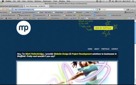
Screen shot of Marks Site

My first impression of the site was that it was clean and modern, neatly laid out and followed a consistent theme. The navigation was easy to find and use and the site used a four column layout throughout.

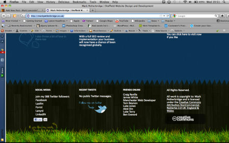
Upon looking at the site in more detail I noticed the footer was grass, a fence then the body was the sky and his logo was the moon. On the right hand side of the page is a display of stars around a button linking to his portfolio work which I thought was quite clever and looked clean at the same time.

Screen shot of the footer of Marks web site

The typography of the site is consistent throughout using the typeface Calibri bold for headings and regular Calibra for most of the body text. More of a personal feel has been added to the site by having little handwritten style comments saying things like “Check out some of my cool & funky work” giving it quite a friendly feel to the site.

The about page gives a nice insight into Mark and his skills and personality, The addition of a picture on this page gives a nice personal touch so you can put a face to the name.

The portfolio page divides the work clearly so you can see exactly what your looking at Identity, Web Design and Print, making it very easy to select what type of work you wish to look at.  The work itself is good showing a range of different skills from design to development.

The contact page displays plenty of different ways to contact Mark from various social networks to his telephone number and a built in contact form allowing users to email him from the site.

From looking at the site overall I found it to be quite good, however I found things I would do differently to make my web site better. These are as following:

  • Less columns on the page as there’s too much information in such a short space.
  • Not to use white for the entire text of the site as it became hard to read after long periods of time.
  • On the Portfolio page display the pieces of work in full not snippets of it in small box’s.
  • Have some way of showing what page you are currently on in the navigation.
  • Have consistent spacing throughout the web site.

Hopefully taking into account everything I have learnt from looking at Marks web site and implementing the suggested improvements when I design my own. I will be able to create a portfolio that not only looks good but is easy to use and find any information required.

In my last post I mentioned what technologies I might be using to create the site. I’m still thinking that I will use HTML 5 and CSS 3 since these are new and upcoming technologies it would be nice to implement them. I’m thinking of using WordPress as a content management system but still not 100% sure yet.

Word Count: 640
Evaluation of self managed learning plan.

November 30, 2010

The summary of my journey of learning PHP is that it has proved a lot more challenging than I could ever have anticipated. Looking back I think I took too much on and set goals for myself too high. I would never have thought anything could be this difficult to learn and cause my so much frustration and sleepless nights.

As I mentioned in my last journal entry I was waiting for a book to arrive which I thought would help me with my PHP contact form. On arrival of the book it looked promising, how wrong could I have been. I wasted three very long days looking through the book and following each instruction that I hoped would help me with my contact form. I would never have thought that a forward or backward slash in the wrong place would cause me this many problems. I had looked at the tutorials for so long they were all beginning to merge into one. After hours of getting angry with myself and it, I found it didn’t do what I originally thought and it wasn’t secure. This was one of my requirements.

After scouting through hours of various tutorials and getting more and more stressed as whatever I looked at didn’t seem to be what I wanted. At this point I resorted to compiling my own from using various sections found in different tutorials.

My image uploader and gallery went a lot more smoothly apart from a couple of errors which I managed to sort out with a little bit of help.

I went on to design my website, which I have to admit was the quickest I had ever designed a website. This is not to say that I didn’t spend much time on it, on the contraire I put a lot more time into it than normal.

Next step came the html coding. I was tired and getting myself worked up as I was making really stupid mistakes that I wouldn’t ordinarily make, well maybe I would sometimes. I remembered the advice given by my tutor who said to take a break from my work and get a few hours sleep. When you wake up then you should be able to continue with a fresh approach. So I took the advice.

Getting up at 4am to start my course work again was hard as I just wanted to turn back over and go back to sleep. I knew I had a deadline to meet so had to get my act together.

Baring in mind I have never done HTML 5 or CSS 3 before and also found that I was running out of time to learn it as I would have liked. This meant that I would have to try to learn it as I went along, which I wouldn’t advise.

While I found that HTML 5 was ok to work with, but I couldn’t say the same for CSS 3. On learning CSS 3 I encountered many problems; it was a nightmare and I was struggling to get it to do what I wanted. Just when I thought that I had finished I thought I would test my website in Internet Explorer. My worst nightmare had come true, I found that it displayed completely different. I spent hours searching the internet for some kind of clue as to how to fix it with no luck. I posted a message on twitter and got a lot of reply’s but none of the solutions worked. At this point I was about to admit defeat when someone posted a link to an article by smashing magazine. This article explained that I needed to link to a java script file. This instantly fixed all my problems with Internet Explorer.

I took the w3schools.com PHP test again and scored 15 out of 20. From looking at my scores from this test and the one I took at the beginning of learning PHP you can see a remarkable improvement.

PHP test results

Although I feel I have learned a lot, I still think I have a lot more to learn before I can say that I’m confident in using PHP.

Word Count: 686

The art of design

April 12, 2010

When asked to write if I thought I was an artist or a designer it took a lot of thought to differentiate which of the two I was.

When I think of an artist I think of people such as Leonardo Da Vinci creating masterpieces paintings like the Mona Lisa for people to gaze upon and appreciate the effort that must have gone into creating such a masterpiece piece of work. Other examples of this include people like Michelangelo creating the great paintings on the Sistine Chapel that was a gigantic 12,000 square feet.

Photo of the Sistine Chapel

There are some forms of art that people dislike and don’t class as art an example of this are people like Damien Hirst who created The Physical Impossibility of Death in the Mind of Someone Living. I wouldn’t class this as art because it all appears like very minimal effort compared to something like the Sistine Chapel, in my opinion he has just placed a dead shark in a box which doesn’t portray any kind of artistic skill.

Photo of The Physical Impossibility of Death in the Mind of Someone Living

Design on the other hand, I think of people like Jonathan Ives who designed such things as the iPod and the iMac just to name a few. These items were created to look beautiful just like a piece of art but being designed with functionality in mind. Another example of this is Jason Santa Maria who designed sites such as Typekit and WordPress all designed to look good but with functionality in mind.

The thing I think differentiates art from design is that art is created for people to admire and appreciate, where as design is created with a purpose in mind. Wether that would be using a flyer/poster or web site to inform someone or sell them a product.  Design has to be functional while still looking good which I think is the difference between the two. Where as art tends to be created once and lasts for a very long time, design is constantly changed and updated. The iPod for example was released in 2001 and has since had 31 different versions this demonstrates how quickly design changes.

A photo of a few iPods

Because of this reason I would say I’m a designer rather than an artist as everything I create has a purpose and function from labels to web sites. When I’m creating I always have the user in mind and how they will look at the label or how they would navigate around a web site. While doing this however I always want to create something that’s visually pleasing to the eye and a user will enjoy looking at.

With this in mind could I be a future Jonathan Ives? Only time will tell.

Word Count: 444